![]()
The City of Detroit has launched a redevelopment plan for the Gratiot/7-Mile community. I’ve been hired by the city and the consulting firm Giffels-Webster as the still-images creative director and photographer.
Our task is to create a series of portraits with two primary goals:
1. Highlight key quality-of-life issues in the community (i.e. public safety, health, mass transit, etc.).
2. Drive community buy-in for the redevelopment plan.
The city identified the Heilmann Recreation Center as a keystone institution in this community. As such, the rec center seemed like a good place to start our portrait project – specifically the rec center’s swimming services.
Swimming pools and swimming instruction is a key to public health. In addition to promoting fitness, they also promote not dying. According to the Centers for Disease Control, inability to swim is a leading risk factor for fatal and non-fatal drowning. This risk factor is higher in urban communities where people either have limited access to pools or flagging interest in learning to swim.
As a person from an urban neighborhood who cannot swim, I felt it important to create images that inspire Gratiot/7-Mile community stakeholders to be nothing like me.
Pre-Production
Here’s where the fun begins. I think of environmental portraits like movie stills. This allows me to indulge my deep-set desire to control everything and everyone I look at. Like a movie director, if you will. As such, my process is very much exactly the same as Steven Spielberg’s. Like, exactly.
Step 1: Identify a location. Step 2: Cast a subject, wardrobe, and props that complement the location and its color palette. With the Heilmann Center identified, one of the biggest pre-production considerations was already accounted for.
Next, finding a subject. My hope was someone with a compelling story and a compelling look (this is, after all, a visual medium). I happened to find just that person in Nicole Valentini. Nicole grew up in the redevelopment area. She also – as evinced by the quote above – had something interesting and beautiful to say about the transformative role learning to swim played in her life.
Done and done.
Now, wardrobe, props, and color palette. Unfortunately, I was not able to scout the location ahead of the shoot. To make sure I was prepared for whatever palette the location presented, I purchased swimsuits, goggles, and swim caps, in a variety of colors. Specifically, swimsuits in pink, white, and yellow; swim caps in red, and blue; and goggles in iridescent blue-green and purple. When I saw the soft blue/white palette of the location, a yellow/red wardrobe with iridescent blue-green goggles felt like the right, complementary choice.
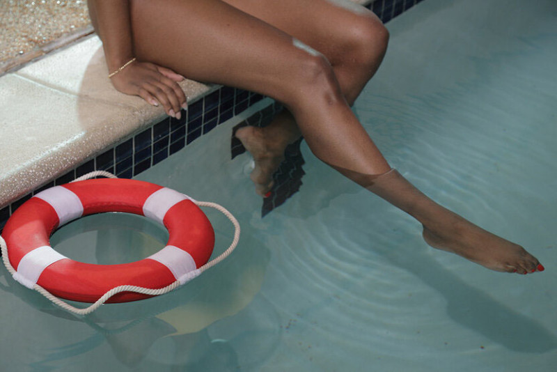
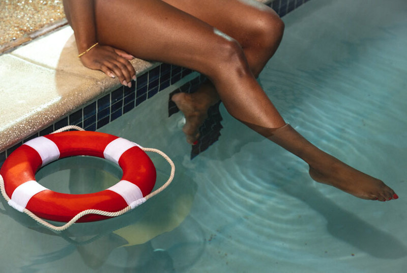
Oh. One thing I knew without ever seeing the location: the water would be blue. To complement this, I purchased a bright red/white floatation device. Since these portraits are about how learning to swim can both literally and figuratively save someone’s life, the floatation devices have both aesthetic and symbolic value.
Capture
I’ve been on a dark kick. My first instinct was to shoot this assignment with low-key lighting. Kill the ambient. Light my subject with a tungsten-gelled strobe, set the white balance to 3400K, and push the shadows with cyan-gelled fill. Luckily, I did not have the time to pull this off (I had two hours to scout and light the location and two hours to shoot). Rather than killing the ambient, it was quicker and easier to work with it. The result was images that are bright, colorful, primary, and triumphant. This worked much better for our story than my go-to Sad Boy Orange/Blue.
![]()
This was the first set-up we captured. Learning to swim allows a person to transcend otherwise dire circumstances. Nicole emerging head held high into the light conveys this idea well. This triumphant idea is amplified by placing the camera low so that it is looking up at our subject. The perspective distortion caused by a close-in relatively wide 28mm focal length makes our subject loom large in her environment. Leading lines and color contrast helped draw the viewer to our heroic subject. A behind-the-scenes shot:
![]()
Tech specs: Canon EOS R with EF 24-105mm f/4L [ISO 1600, 28mm, f/5.6, 1/30 sec, white balance 4200K]. Orlit 610 TTL camera left into Westcott 7’ reflective umbrella on ETTL 0. Strobe has a 1/2 CTO gel. This gel converts the strobe’s 5600 daylight output to roughly 3800K. The color temperature of the ambient is 4000-4200K give or take. So, the color of my added light more or less matches the color of the ambient light. ETTL allows the camera to figure out the right exposure for the light. This is super useful in situations where you are moving quickly and unable to manual meter light output.

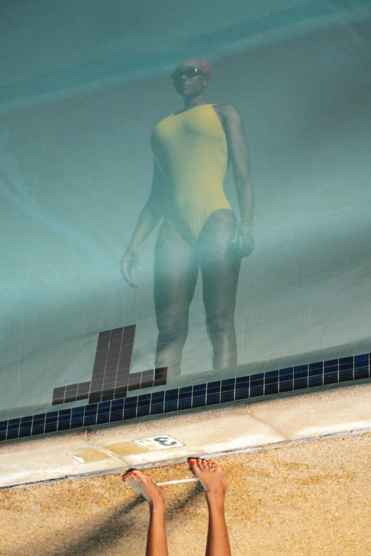
Well, this portrait just makes me happy. There’s just so much here that speaks to me. Even when we are cautious and measured, life can be upended. Inverted. Leave you disoriented. Despondent. Steady yourself. Face the abyss. Move forward – even if only by one shallow step at a time.
In the last two or three years, I’ve faced adversity beyond anything I ever thought I would. I’ve persevered thanks to the love and support of friends who I consider family. They are the reason I was here on this day and able to make this photograph. I believe the only purpose that exists is the purpose we create for ourselves. I believe our purpose is to do what we can to improve the lives of other human beings. I am honored to be a part of the Gratiot/7-Mile redevelopment project and I hope my contribution in some small measure does just that.
Annnnnnnnnnd, now lighting: Roughly the same set-up as the previous image. The only difference is Nicole is standing along the back edge of the pool (the edge by the sandbag that should have been of the big leg of the keylight’s c-stand, but I goofed). Also, the gridded blue/cyan gelled fired here. That created a beautiful, subtle edge light on the subject’s left side. This perspective was possible because I shot from about 8-feet up on an A-frame ladder. Also note the change in shutter speed from 1/30 to 1/160. This cut the ambient light and deepened the color of that water. This created a deep blue/green canvas for Nicole’s bright yellow swimsuit.
The photo was then rotated and flipped on its horizontal axis – just like life.
Oh, one more thing! The great thing about the 7-foot reflective umbrella is it can be aimed! Originally, it was at about a 45-degree downward angle. Too much light spilled into the pool. This caused Nicole’s reflection to be too faint. So, I feathered the light at about a 20-degree upward angle. This meant the light only hit Nicole and the water stayed dark. Without this lighting disparity, her reflection would not be apparent. I figured this out in the moment and – given my limited experience with pools – I was pretty proud of myself.

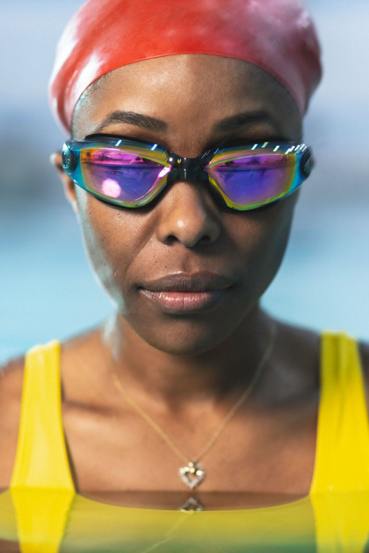
The final lighting set-up was fairly simple. One strobe camera left into a 43” shoot-through umbrella with a 1/2 CTO gel. Two strobes with 7-inch reflectors on the shore behind Nicole and on either side with blue/green gels. The surprisingly awesome and relatively cheap Canon 85mm f/1.8 was used for the close-up portraits. I used a super-slow shutter speed to cause motion blur in the parts of the image lit by ambient light while the parts lit by strobe were razor sharp. I did this completely on purpose. This setting was not a happy accident that I would have totally avoided if I wasn’t rushing to wrap the shoot before our deadline. Totally.
Post-Production
Most post-production was done in Lightroom. Here’s my post-post-processing rationale:

Painterly images with lots of shadow detail are what speak to me. Here’s how I create that feel. First, move the Exposure slider until everything in the scene looks sufficient bright OR until the hills and peaks touch the right side of the histogram. Next, lower contrast. Third, recover Highlights if the scene has a lot of dynamic range (i.e. backlit, sunset, etc). If not, leave it be. Fourth, raise the Shadows to taste. Fifth, raise the Whites to taste and lower the Blacks a bit. While this sounds like strategy cribbed from Donald Trump’s re-election campaign, it’s really just a more controlled way of re-introducing contrast and brightness. I find it makes images pop without looking too contrasty or oversaturated.
Speaking of saturation, lower Vibrance to about -25 or so. Then, raise the Saturation to 20. OR, do the reverse. It really depends on the image, your tastes, and your camera’s capture settings (I prefer to turn down saturation about two notches in-camera). Next, go under Color Mixer and use the eyedropper tool to select specific colors you would like to emphasize or subdue. Finally, boost the Clarity a bit and decrease texture. I find this makes edges feel more defined without introducing halo artifacts. That’s the Lightroom workflow for these images.

Work in Photoshop was minimal. Mostly just using the Heal tool to get rid of spots, blemishes, and other distracting elements (both on the subject and in the scene), and some selective dodge and burning. Flatten PSD, convert to sRBG, resize to 3840px (1200px for Facebook), and make a jpg. That’s it.

I hope this behind-the-scene tutorial was informative, helpful, and inspirational. If you’re like to see more content like this, follow my Instagram.
About the author: Noah Stephens is a Detroit-based portrait photographer. The opinions expressed in this article are solely those of the author. Stephens founded The People of Detroit in 2011 as a counterpoint to Detroit-focused ruin porn. That led to commercial assignments for McDonald’s, Ford, General Motors, Ally Financial, and “Detroit” by Oscar award-winning director Kathryn Bigelow. He enjoys science and philosophy podcasts, cycling, and considering our position in the infinite cosmic void. You can find more of his work on his website, Facebook, Twitter, and Instagram.
Credits: Client: City of Detroit Planning Department/Giffels-Webster. Photography and Creative Direction: Noah Stephens. Subject: Nicole Valentini. Assistant: Sterling Hurd. I’d like to give a special thanks to Nicole, Sterling, and Heilmann Rec Center supervisor Byron Spivey. Also, Khalil Ligon in the City Planning Department and Michael Darga at Giffels-Webster for bringing me on board for this project.
from PetaPixel https://ift.tt/2Iv3reR
via IFTTT


0 comments:
Post a Comment