We live in a world that’s increasingly becoming digital. Most people consume digital content on business websites, blogs, social media platforms, etc. on a regular basis. So, there is a huge demand for professional photographers today.
If you are a professional photographer yourself and want to take your business to the next level, then you should seriously consider building a brand. An easy but quite effective step for that is creating a unique logo.
The following are some of the most amazing photography logos that you can check out for inspiration for your own design.
1. Jeff Sturgess
Created by: Moham MK
2. Michael Schmidt
3. Leo Bloom
Created by: Tailor Brands
This logo shows that simple logos can often be the most effective. As you can see, the main icon here is a camera shutter. It looks pretty basic but the choice of font and background color makes the overall design unique and attractive.
4. FotoMart
5. Baku Photography

Created by: MehmanMammedov
Here is something that many people don’t know- photographers are returning to film to enjoy a higher dynamic range and create images that look authentic and natural. So, a skilled photographer who is into old-school photography can use a logo like the one above. Note how it uses a light shade background visual to complement the foreground logo to provide some “bulk” to the overall design.
6. Janet Dorian
When you create a website for your photography, then you want everything to look perfect including the logo. The example you see above is perfect to illustrate this point. This is because it’s based on a simple whitecolor font and icon that look beautiful on the colorful background.
7. Pixlarte Studio
8. Shutter Muse
This is another good example of a photography logo which doesn’t use an apparent design that represents photography. However, this logo isn’t totally unrelated. The elephant icon represents strength and impact, which are the qualities that the photographer wants to highlight about themselves. So, in that way it makes sense and it also sends across subliminal messages.
9. MCLEMENTS Photography
Created by: Dedijobs
11. Third Eye
In this example, not only the brand name is catchy but the design is also quite interesting. The central icon is a combination of a human eye and a camera’s lens which is a pretty good choice. The designer also did a great job of sticking to minimalism in the design in terms of color palette, and that makes the logo really pop.
12. Pixjax
13. Rebel Lens Photography
14. Louise Cuppello Photography
Created by: Peppermint Moon
15. Palacios Photography
This is a good example that proves that good logos need to look nice even when they are in black-and-white. Since this logo is pretty simple and doesn’t rely on different kinds of colors, you can apply a greyscale filter and it will still look attractive.
16. Cipriano Palmer Photography & Cinematography
17. Hollins Films
Created by: Jay Design
18. Laura Johns Photography
The designer here took minimalism to a whole new level. As you can see, they focused on the initials of the photographer and added a simple twist to it to make it unique, and it works!
19. Logan Photography
20. T&J
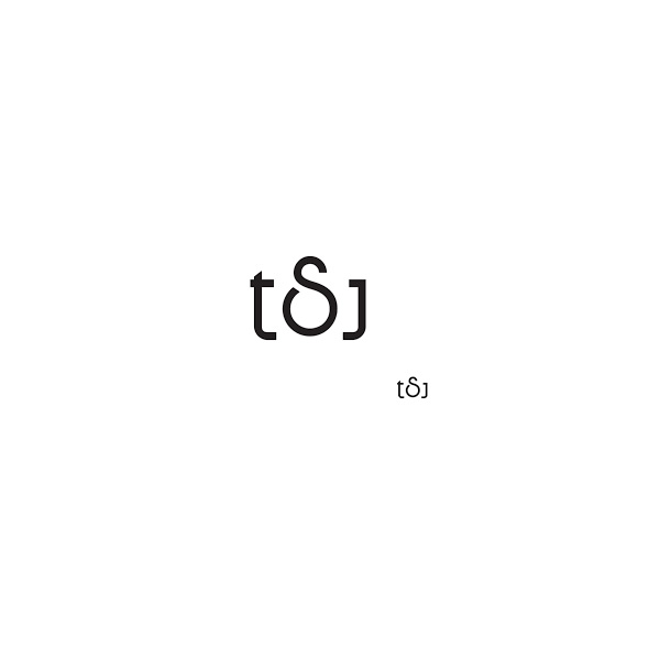
This is an example of a lettermark logo. The initials of two photographers (Thomas & Jade) are combined together in an abbreviated form to make the logo easy to remember and attractive.
There you have it- 20 attractive logo designs that are sure to inspire you and give several ideas for your own designs. Which ones did you like the most? Let us know in the comments section below!
from 121clicks.com https://ift.tt/2Z8d79T
via IFTTT


0 comments:
Post a Comment